As always, I was not going to miss out on buying the new Manchester United home jersey to add into my collection however this year is slightly different. Usually we pride ourselves with some of the best designs in the English Premier League for our kits, especially the home ones.

We all remembered the "Theater of Dreams" jersey.

Also one of my favorites which was the embossed with zipper Treble jersey.
and of course the Canton Collar home jersey.
But this year's jersey got a lot of people's tongue wagging a little bit and unfortunately it is not for the positive. Nike decided that the design for this upcoming season would go back to the very roots of Manchester itself. Historically, Manchester pride itself through their cotton industry that helped paved themselves into the Industrial Age revolution and to commemorate that, they incorporated that notion into this year's design.
Enter the Manchester United Cotton Jersey
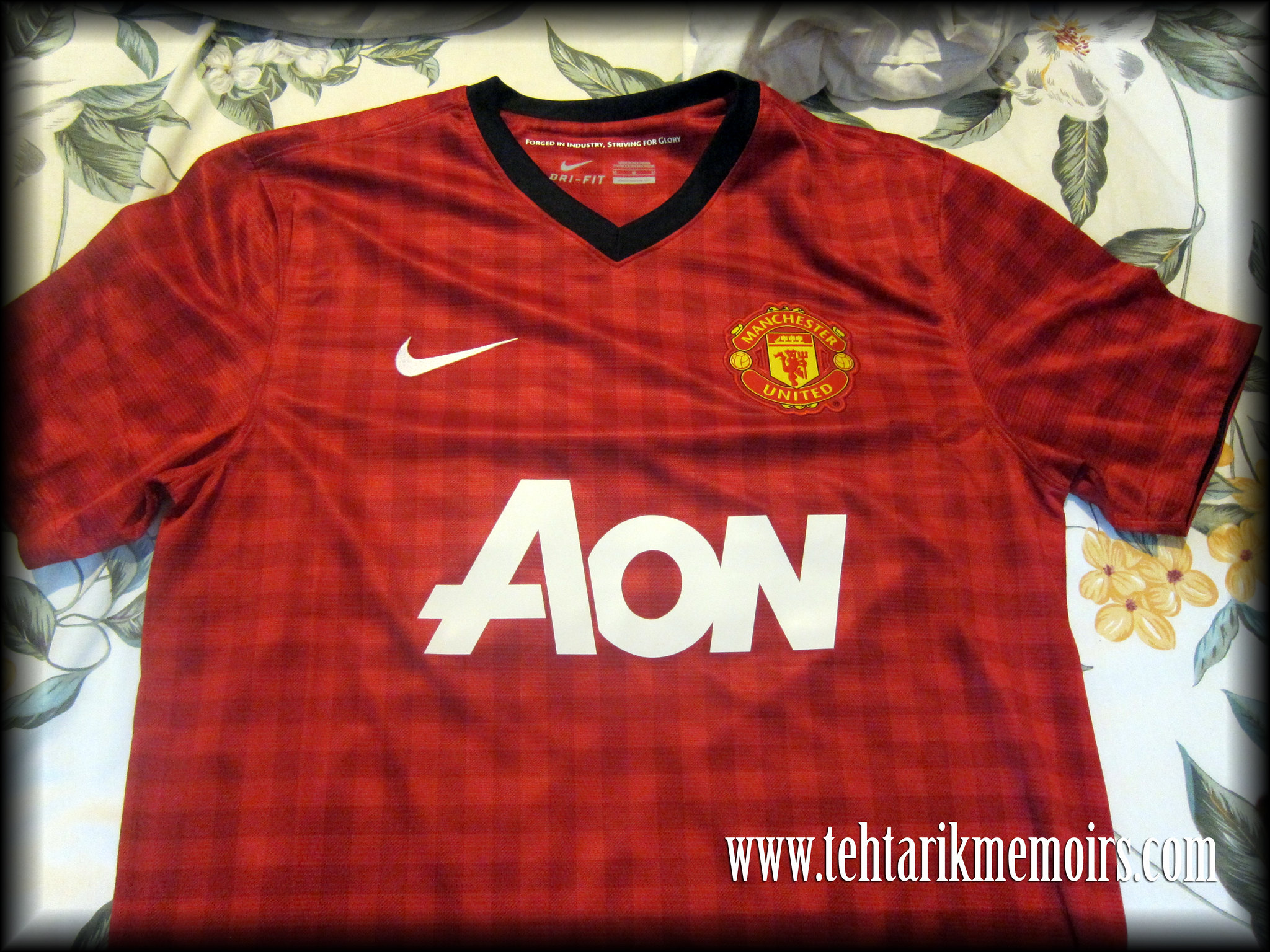
[Forged in Manchester?]
Sporting the classic red and black collars like always, this would be the second last time we would see Aon as their main sponsor (see HERE) with what appears to be the checkered design of a cotton, also known as the "Gingham Design".
My take on this at first was that I could not understand the design to be incorporated into the jersey. Although in closer inspection it does have some traits that does have a lot of benefits but the design in general, I was not feeling it.

[Forged in Industry, Striving for Glory]
However, I do have to say it does have some slickness in the design if you set aside the checkered layered design of the jersey. To some extent the design seem to put more focus on the jersey itself which is of course a good thing.

[The Emblem]
One thing I was disappointed about is that they took out the wording they usually print behind the emblem in the previous jerseys. Back then, it was one way to determine whether or not the jersey is authentic or not because you could never print something at the back of the emblem without it coming out in the front.
So, I know that other people have been saying that the jersey is crap. They say that the jersey itself look like a table cloth.
A table cloth.
Well as Stormy Zaaba mentioned to me is this:
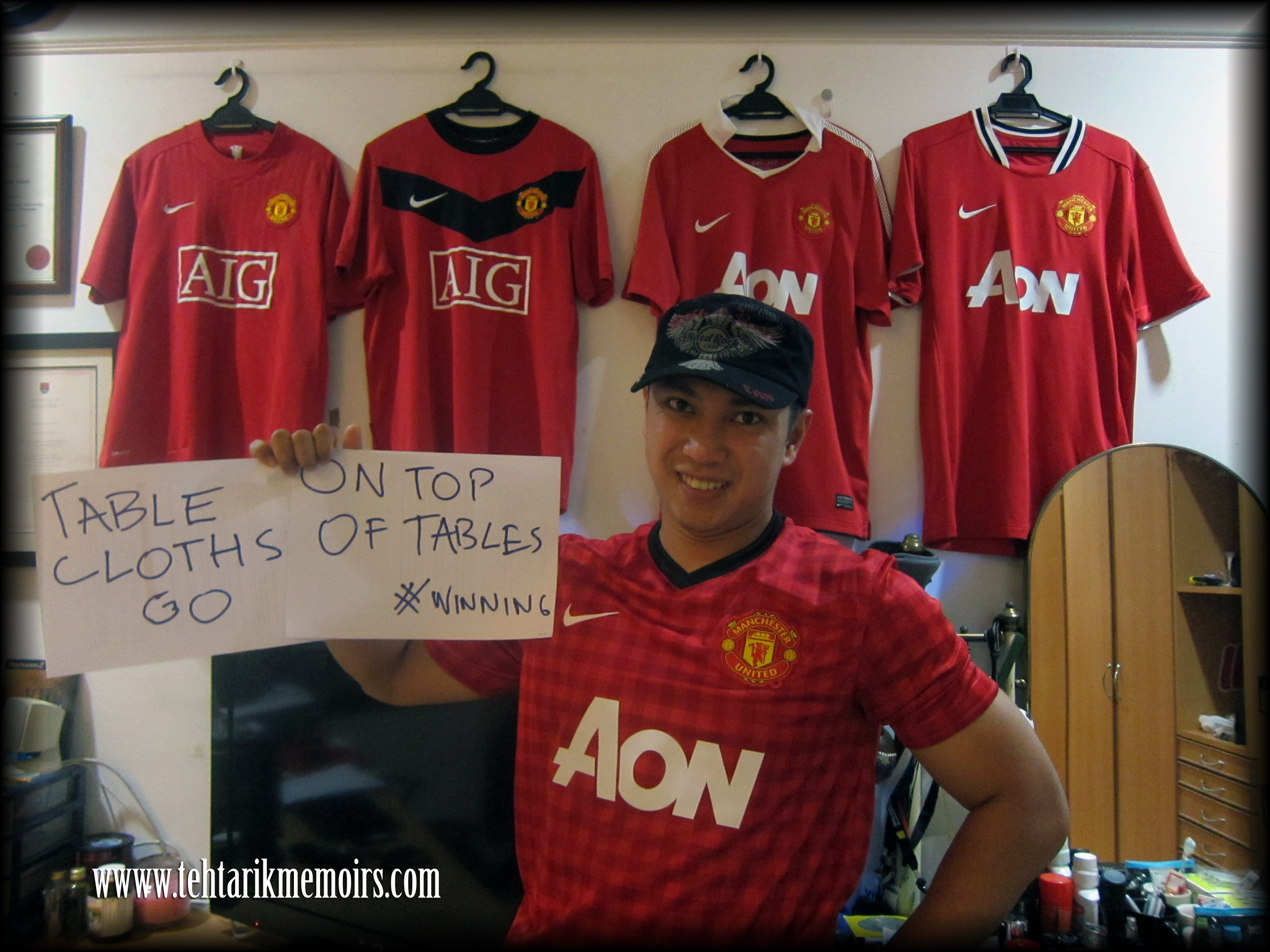
[Table Cloths Go on Top of the Table. #win]
Bring on the season.
check out more posts like this under Ye Olde Sports
Nang this post if you like it guys! Thanks!
Follow the TehTarik way


Still 2 seasons to go for AON, as Chevrolet will only be printed on our shirt starting the 2014/15 season.
ReplyDeleteok baju man utd..lawa
ReplyDeletethanks for the heads up mate, made the necessary changes on the post! :D
ReplyDeleteboleh tahan gak. tengok la camana rupa kat padang
ReplyDeleteAs much as I support MU, I don't even own an MU jersey till today. :P
ReplyDeleteah perhaps it is about time bro? :D
ReplyDelete